Hello Everyone,
Sorry for the delay on these posts, been feeling seriously crap but I'm slowly getting the backlog up to date. The submission disc art work was literally a quick job this time, I was rushed just 30 or so minutes before crit and knocked something together, it is for this reason that the final one has a few bits missing from my usual designs. Never the less it works was just a bit gutted that I couldn't spend more time making it "amazing" as it were. Never the less it was quite good for a rush job, next time I may have to consider the disc earlier.
Anyway, the crit went well last Thursday and deep down I had that sigh of relief which was my body's way of shaking off a burden. Every day I didn't achieve something was a day I worried that I was letting my group down but I'm glad to know that I brought it home and in the end everything worked out despite my issues here and there. There are a total of 3 more posts after this one and one more that I may post up in January... I still have a book to make.
Now lets get down to it!!
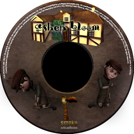
The disc was a very quick knock together I quickly tried a few things but wound up settling on the house being built into the logo. I then thought I'd dot around some versions of Charles which I liked showing his conflicting personalities. The real vs. fantasy. Of course the Smoke Stack logo was going to be part of the disc also it made my life simpler and help me isolate the sections which I had remaining. The garbage around the top is something I always add I wrote it some time back but it makes the disc look official :P
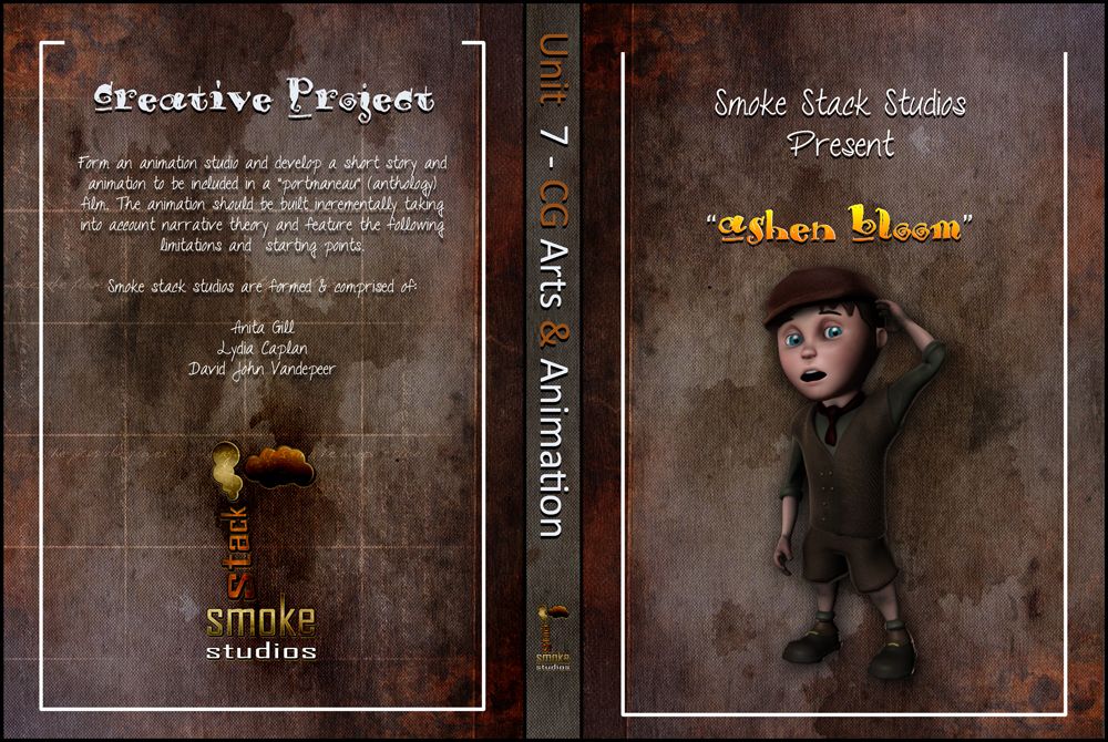
The cover again was a quick knock together I didn't notice until later but I even missed the course name on the top left grrr.... oh well. As I said when it was printed I don't think I actually noticed, it just looked neat... I probably should have tried to embed a little more of it with Bevel, never the less it still looks pretty awesome especially once its printed. More importantly the design works and I'm so chuffed that I managed to get Charles on the cover with my favourite scratch head pose haha... My favourite because I'm doing it on a daily basis.
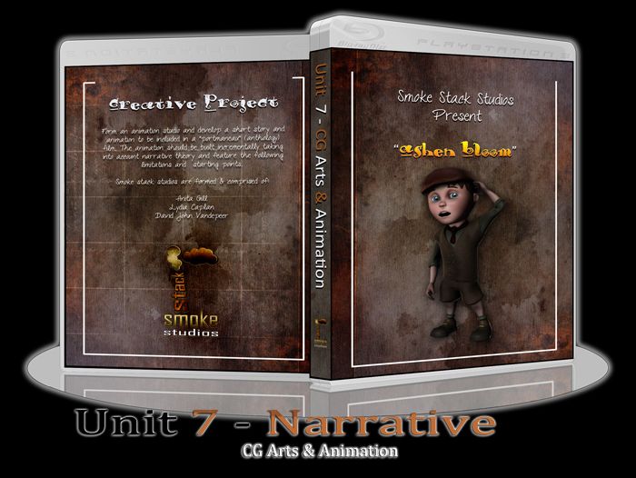
The next and final trick is my usual submission disc display a little something I do just because I think it looks cool to visualise. I had to put a glow around this one though, completely forgot about the black text. Never the less this is probably one of my more favourite designs, I just love the mix and match of colours, really does something pleasing to my eye. My need to create media based on books is still unwavering, I guess its my way of being able to see something at the end of the creation process as it is fed from my printer and into my hand.
Anyway I hope everyone is having a lovely break and I will be back hopefully tomorrow with a couple more posts. Still feeling a little garbage.
Over & Out,
xXStItChXx


No comments:
Post a Comment